
 |
| That's the TIE/LN specifically for my fellow supernerds |
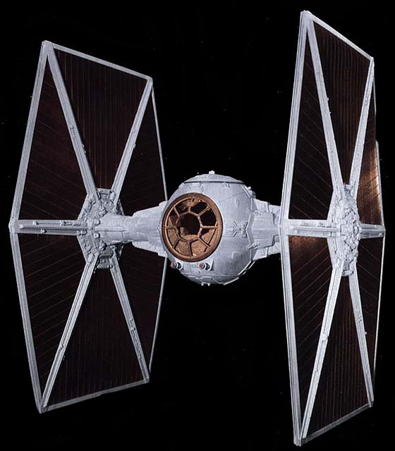
I don't mean to say that within its universe it's the most powerful ship, or even the most cleverly and efficiently designed. It certainly isn't the most realistic. What I mean is that if one were ever asked to draw a spaceship, the TIE fighter would be the easiest to get across quickly while also being interesting to look at.
Why is that? Some designs are interesting to look at but not simple or easy to remember (like many modern ships designed for video games) and some are exceedingly simple but not interesting (your standard flying saucer). What makes the TIE fighter so memorable, iconic and "draw-able" comes down to a simple equation;
simple + interesting = memorable
Simplicity isn't synonymous with boring, and interest isn't generated exclusively by complexity. A TIE Fighter is made up of 3 simple shapes (sphere, cone, hexagon) that on their own are boring, but are cunningly fit together to create a unique design. Compared to the rebel starship designs, which are more reminiscent of familiar planes and jet fighters, the TIE fighter is a cyclopean insect, swarming towards the viewer in the thousands on solid, hexagonal wings. It's a single-minded drone that emphasizes not only the inhuman nature of the empire but the disposability of the pilot within. It screams evil and oppression without a single silly spike or skull lashed to the hull. It's great.
 It's made even better by the fact that its design is easy to remember. That memorability is advantageous in so many ways; being easy to remember it's easy to draw, encouraging fan projects (free advertising); it makes the artists' job (whether that be concept artist, modeller, cinematographer, director etc) easier by being an easily lit and readable object; it sticks in customers and fans' minds more easily - etc. and etc. to Alderaan and back.
There are great examples of this equation in all forms of media... but sadly there seems to be too few. Sadder still is the lack of these simple and effective designs both in student portfolios and in some of our favourite settings. I won't critique specific examples, but videogames seem to have a problem with excessive design, with bits and bobs strewn about over a character in an effort to make him or her stand out, to seem "realistic" or particularly bad ass. The problem is all that clutter simply gets in the way and prevents our eyes from really "grabbing" the idea of the design. I can't tell you how many games I've played relatively recently that contain character designs that aren't memorable.... simply because I can't remember them!
So how do you, as an aspiring or working artist, approach this problem? How do you give a client what they (think they) want, which is detail, while still creating a cohesive, interesting, and memorable design? Let's do a little exercise, take a look at a few do's and don't's and see if we can make something you'll remember.
Let's start with a fantasy character. You might think this is starting things off easy, but it isn't; fantasy characters are everywhere, competing for attention in a crowded space of the public eye. The fact that general "fantasy" characters are quite ubiquitous in movies and video games means that making them memorable is a challenge.
Here she is! Fresh off the character-creation-system of the imagination, ready to be clothed in pixels and to then hopefully set down roots in our memory. We'll try two different types of character and narrow her down a bit so our challenge has some direction - one version of her will be an armoured warrior who hails from a tropical, sea-faring civilization while the other will be an arctic rogue - a thief or assassin in the snow.
Here are three things to remember when creating and simplifying a design;
"One or two" is where we limit the amount of elements in the design; one or two major shapes; one or two main colours; one or two motifs. "Repeated" is simple enough; repeat those few elements throughout the design. "United" is where each element serves the whole, where elements appear in similar or connected places (arms and legs, hands and feet, elbows and knees etc.).
 Let's start with the Warrior. Living in a watery, tropical area gives us some unique practical considerations to play around with as well as a good number of potential motifs to integrate into the design. She might be in relatively heavy amour, but freeing up the arms and legs (which are almost always of secondary importance) gives the impression of freedom of movement, very important if she needs to wade or even swim through water in an emergency.
One or Two - For motifs as well as shapes, let's go with the obvious but effective crescent-shaped waves as well as the bulbous, rounded carapace of a crab; not only does it provide a visual contrast while maintaining a "natural" feel, it also evokes a sense of hard shells and protection. For main colours, sea-foam green and red-orange is a striking and tropical contrast. I say MAIN colours as an important distinction; there are inevitably going to be a few more hues than just two; the colour of her skin, the sandy colour (no accident) of the underpadding, the colour of her steel sword, her black hair, etc. There are however colours that stand out, and colours that don't. The sea-foam and red-orange are the stand-out, memorable colours. Her skin, hair, underpadding and netting are far less contrasted which each other, and offer a neutral base. This base doesn't impact the readability of the main colours and so are an exception to the "one or two" guideline.
Repeated - The nature of the waves demands us to repeat those crescent shapes throughout. The crab, while being a central focus on the chest, finds itself orbiting the main crab on the shoulders, hands and knees. The underpadding is also repeated.
United - Here's the tricky part, where all the pieces are not only fitted together, but in a way that reinforces simplicity. That big, bright red crab can sit smack dab in the middle of her chest. It's the big, shiny button that is noticed first, and hopefully acts as the mnemonic device of the design. The sea-foam armour will be in one spot underneath it to frame it and keep things simple. The underpadding crab armour will be repeated in conceptually similar "end-cap" places- the lower arms and lower legs.
 On to the Rogue. Like the warrior there are some practical design choices such as relatively warm but light clothing, and well-worn themes such as fur, polar animals etc. Unlike the warrior, her palette is going to be a bit more subdued. You can't always add whatever elements you wish to characters you're creating for clients, so "bright, distinct colours" isn't a weapon you can always have in your arsenal. Luckily value is a (potentially more) potent tool you can use in less saturated designs.
One or Two - The motifs here can be even more simple; her cloak and claw-gauntlets will be made from a polar-bear's hide. Two main colours, or rather values, are the unsaturated grey/white of the fur and black/grey of her clothing. Those are also the two types of main materials as well. The varying tan colours of her face, claws, weapons and slashes in her dark outfit all settle back as secondary colours.
Repeated - The fur is repeated on her hands and also on her boots. Her 3-claw pattern on her gauntlets is also repeated on her hips with the braces of 3 throwing knives. there are also some cut-and-tied segments between the joins of her clothing. These are in a practical sense a way to limit the sound her outfit makes when trying to move silently, and in a design sense allows some repeated patters that highlight her joints.
United - Here we have another case of one colour or value enveloping or cradling another. the white of her hood surrounds her dark hair and face, and the rest of the cloak surround her dark clothing, with the clothing itself creating a dark triangle that moves up to her face. this design is more separated than the warrior's, almost cut in half by the two values.
That subheading is actually a little late, as we've already dealt with interesting shapes and motifs in our designs already. I'd argue that "interesting" much like "composition" is a concept that can't be excised from the ideas and elements that built it up in the first place. What I'm going to be talking about here is a specific principle that deals with creating detail without sacrificing the overall read of various elements or the whole.
These are the tertiary reads, the thing the viewer notices after the first two important elements. The viewer, when looking at the warrior design, is likely going to notice the large, bright, central crab. Primary read. Then they'll notice the other major elements like netting or wavy, watery armour. Secondary read. Then this hypothetical (and to be honest, methodical) viewer is going to notice.... the little bits. The swirls of detail in the waves. The bulbous bits of carapace jutting out. The small hints of personal history that don't stand out, don't get in the way, but are there to be found and appreciated if one were looking close enough.
Tertiary read.
This whole section might seem long winded for the rather mundane advice of "put some minor stuff on there" but it's very relevant to the problem of clutter that I see so often with fantasy design. Let's see it applied to our characters;
 The warrior has seen a jump in detail with her armour, many more waves of varying value and saturation decorating it. The shift in colour is small enough that the sea-foam armour still reads as a single unit. She can also sport some netting over her underpadding,both to tie her once more to the sea but also as a practical way to keep the padding tight to her body in case she does have to swim. This netting is also in line with the "repeated" principle, as it's made up of many repeated lines but also is repeated throughout. Finally it also is "united" in that it's only and always seen on top of the padding. For other minor elements we could add some sea-shell or jade accoutrements.
 The snow-rogue is even simpler. Unified and subtle detail can be added in the fur and in the overlapping leather bits of her rogue outfit. Small, subtle patterns can create detail and the illusion of complexity without losing the impact of the whole.
Finally, let's take a look at some bad examples I cooked up. I actually challenged myself to make something that on the surface might seem complex and interesting, but forced myself to not think about all of the simplifying design principles. Take a look at them side-by-side with their simplified counterparts;


All of the themed material is there; shells and fins and wave details for the warrior, fur and leather and claws for the rogue. What's also present is way too much everything. Too many materials, items, colours and shapes that are scattered about haphazardly, all without their own territory or chance to shine. You might argue that they might look "cooler" or more deadly or impressive at a glance, but try remembering their design. Try to remember what was there, what shape it was, where it was placed. Chances are some time from now you'll draw a relative blank. They are brainless, throwaway designs that I came up with on the spot with no thought whatsoever, and the less I see of these types of designs (even though I wouldn't remember them for long in the first place) the better. With the simple designs you might not remember every little detail, and for sure they're not the most amazing, award-winning character designs you'll come across.... but you'd probably remember that big bright crab surrounded by sea-foam, or a sliver of darkness running up through a white shroud.
There are great examples of this equation in all forms of media... but sadly there seems to be too few. Sadder still is the lack of these simple and effective designs both in student portfolios and in some of our favourite settings. I won't critique specific examples, but videogames seem to have a problem with excessive design, with bits and bobs strewn about over a character in an effort to make him or her stand out, to seem "realistic" or particularly bad ass. The problem is all that clutter simply gets in the way and prevents our eyes from really "grabbing" the idea of the design. I can't tell you how many games I've played relatively recently that contain character designs that aren't memorable.... simply because I can't remember them!
So how do you, as an aspiring or working artist, approach this problem? How do you give a client what they (think they) want, which is detail, while still creating a cohesive, interesting, and memorable design? Let's do a little exercise, take a look at a few do's and don't's and see if we can make something you'll remember.
Step One - Simple
One or Two. Repeated. United |
| Fear the Placeholder Stick. |
Here are three things to remember when creating and simplifying a design;
Simple is one or two. Simple is repeated. Simple is united.
"One or two" is where we limit the amount of elements in the design; one or two major shapes; one or two main colours; one or two motifs. "Repeated" is simple enough; repeat those few elements throughout the design. "United" is where each element serves the whole, where elements appear in similar or connected places (arms and legs, hands and feet, elbows and knees etc.).

One or Two - For motifs as well as shapes, let's go with the obvious but effective crescent-shaped waves as well as the bulbous, rounded carapace of a crab; not only does it provide a visual contrast while maintaining a "natural" feel, it also evokes a sense of hard shells and protection. For main colours, sea-foam green and red-orange is a striking and tropical contrast. I say MAIN colours as an important distinction; there are inevitably going to be a few more hues than just two; the colour of her skin, the sandy colour (no accident) of the underpadding, the colour of her steel sword, her black hair, etc. There are however colours that stand out, and colours that don't. The sea-foam and red-orange are the stand-out, memorable colours. Her skin, hair, underpadding and netting are far less contrasted which each other, and offer a neutral base. This base doesn't impact the readability of the main colours and so are an exception to the "one or two" guideline.
Repeated - The nature of the waves demands us to repeat those crescent shapes throughout. The crab, while being a central focus on the chest, finds itself orbiting the main crab on the shoulders, hands and knees. The underpadding is also repeated.
United - Here's the tricky part, where all the pieces are not only fitted together, but in a way that reinforces simplicity. That big, bright red crab can sit smack dab in the middle of her chest. It's the big, shiny button that is noticed first, and hopefully acts as the mnemonic device of the design. The sea-foam armour will be in one spot underneath it to frame it and keep things simple. The underpadding crab armour will be repeated in conceptually similar "end-cap" places- the lower arms and lower legs.
 On to the Rogue. Like the warrior there are some practical design choices such as relatively warm but light clothing, and well-worn themes such as fur, polar animals etc. Unlike the warrior, her palette is going to be a bit more subdued. You can't always add whatever elements you wish to characters you're creating for clients, so "bright, distinct colours" isn't a weapon you can always have in your arsenal. Luckily value is a (potentially more) potent tool you can use in less saturated designs.
One or Two - The motifs here can be even more simple; her cloak and claw-gauntlets will be made from a polar-bear's hide. Two main colours, or rather values, are the unsaturated grey/white of the fur and black/grey of her clothing. Those are also the two types of main materials as well. The varying tan colours of her face, claws, weapons and slashes in her dark outfit all settle back as secondary colours.
Repeated - The fur is repeated on her hands and also on her boots. Her 3-claw pattern on her gauntlets is also repeated on her hips with the braces of 3 throwing knives. there are also some cut-and-tied segments between the joins of her clothing. These are in a practical sense a way to limit the sound her outfit makes when trying to move silently, and in a design sense allows some repeated patters that highlight her joints.
United - Here we have another case of one colour or value enveloping or cradling another. the white of her hood surrounds her dark hair and face, and the rest of the cloak surround her dark clothing, with the clothing itself creating a dark triangle that moves up to her face. this design is more separated than the warrior's, almost cut in half by the two values.
Step Two - Interesting
Clutter it up... the smart way!That subheading is actually a little late, as we've already dealt with interesting shapes and motifs in our designs already. I'd argue that "interesting" much like "composition" is a concept that can't be excised from the ideas and elements that built it up in the first place. What I'm going to be talking about here is a specific principle that deals with creating detail without sacrificing the overall read of various elements or the whole.
These are the tertiary reads, the thing the viewer notices after the first two important elements. The viewer, when looking at the warrior design, is likely going to notice the large, bright, central crab. Primary read. Then they'll notice the other major elements like netting or wavy, watery armour. Secondary read. Then this hypothetical (and to be honest, methodical) viewer is going to notice.... the little bits. The swirls of detail in the waves. The bulbous bits of carapace jutting out. The small hints of personal history that don't stand out, don't get in the way, but are there to be found and appreciated if one were looking close enough.
Tertiary read.
This whole section might seem long winded for the rather mundane advice of "put some minor stuff on there" but it's very relevant to the problem of clutter that I see so often with fantasy design. Let's see it applied to our characters;
 The warrior has seen a jump in detail with her armour, many more waves of varying value and saturation decorating it. The shift in colour is small enough that the sea-foam armour still reads as a single unit. She can also sport some netting over her underpadding,both to tie her once more to the sea but also as a practical way to keep the padding tight to her body in case she does have to swim. This netting is also in line with the "repeated" principle, as it's made up of many repeated lines but also is repeated throughout. Finally it also is "united" in that it's only and always seen on top of the padding. For other minor elements we could add some sea-shell or jade accoutrements.
Finally, let's take a look at some bad examples I cooked up. I actually challenged myself to make something that on the surface might seem complex and interesting, but forced myself to not think about all of the simplifying design principles. Take a look at them side-by-side with their simplified counterparts;


All of the themed material is there; shells and fins and wave details for the warrior, fur and leather and claws for the rogue. What's also present is way too much everything. Too many materials, items, colours and shapes that are scattered about haphazardly, all without their own territory or chance to shine. You might argue that they might look "cooler" or more deadly or impressive at a glance, but try remembering their design. Try to remember what was there, what shape it was, where it was placed. Chances are some time from now you'll draw a relative blank. They are brainless, throwaway designs that I came up with on the spot with no thought whatsoever, and the less I see of these types of designs (even though I wouldn't remember them for long in the first place) the better. With the simple designs you might not remember every little detail, and for sure they're not the most amazing, award-winning character designs you'll come across.... but you'd probably remember that big bright crab surrounded by sea-foam, or a sliver of darkness running up through a white shroud.
Thank you so much, Jason, that was really really helpful and informative. Much to think about. Cheers :)
ReplyDeleteExcellent post Jason!
ReplyDeleteI found myself noding with passionate agreement the whole read.
As I practice and study art, I constantly find myself returning to the concept of simplicity. The ideas expressed here can be applied more abstractly to composition in general. To me, the process of concepting an environment, a character, or composing an abstract painting, are not so different. Simplicity isn't easy though. It requires much more brain power to compose with just those one or two visual elements; so much easier to just add a few more belts and layers of fabric. Speaking of which, your "bad" version of the rogue look like a great contender for a future Assasins Creed game set in the arctic (that wrist spike looks awesome btw).
You can know a design is exceptional, when it makes you wish you'd thought of it first. As I feel to the work you've done here! I'm sure similar bear cloaks have been done before, but you've done it so well, and so thoughtfully, I struggle to imagine a better solution.
These concepts are also useful for achieving the opposite effect - to make things unmemorable. In my opinion it's a more important skill, since on the majority of project the main characters are already established and the majority of the work is designing secondary and background characters. They can still be memorable, but should be tuned relative to the primary cast and story.
ReplyDelete"He's got to like you then forget you the moment you've left his side" -Rusty
Do comment on Marko Djurdevic's designs of degensis cultures....to me, they just seem so cluttered. while definatelly cool i just cant see anyone wearing that much shit on them on a regular day. He has the main ideas down, the colors as well, unification and repetition but the memorability is lost on most of them.
ReplyDelete